Principles
Buttons must allow the user to complete a specific action with a single tap (Material.io, iOS Human Interface Guidelines, UWP).
All buttons must have a relevant action. Do not include inactive or disabled buttons (GOV.UK Design System).
Buttons must:
- Display a clear message relating to the action of the button (Material.io, iOS Human Interface Guidelines)
- Adapt to different devices and screen sizes - see Responsiveness and Adaptivity
- Provide short text, which fits the button size
- Provide the minimum touch target size of 44px x 44px, surrounded by a small amount of inactive space (WCAG 2.1, Material.io)
The button size must equal the size of the button text, with 16dp padding either side (Material.io). See the Icons and Assets page for downloadable examples of buttons.
Touch Targets
| px | dp | mm |
|---|---|---|
| 44 | 58.6 | 9.3 |
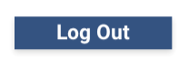
Contained Buttons
Contained buttons’ colour fill and elevation make them visually distinctive.
Contained buttons must:
- Perform an important action with a single tap (Material.io)
- Use colour consistent with the colour palettes (Material.io) - see Branding
- Use title case for button text (iOS Human Interface Guidelines)
Contained button designs must include:
- Rectangular shape
- 2dp elevation
- Central alignment on the screen or popup
- Appropriate font and font colour for button text - see Typography
- Text positioned on the centre of the button
Sample Log Out
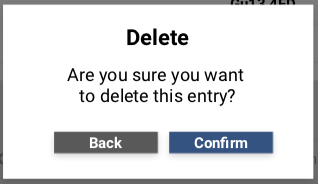
Pop Up Buttons
For buttons within a pop up message, buttons must:
- Appear side by side, at the bottom left and right of the message
- Have at least 8dp between buttons
- Use consistent messaging - see Pop Ups
- Display one or two action buttons for the user to select from (Material.io)
When the pop up provides two actions, the popup must show two action buttons, like providing an option to delete:
- One button must confirm the action (primary action button)
- One button must dismiss the action (secondary action button)
When the pop up provides a single action, like an error message, the popup must show a single action button:
- An invalid password popup reads: Please enter a valid password. Single button reads: OK
Pop up buttons must appear on the appropriate side and in the appropriate colour - see Pop Ups:
- Primary action button, such as Confirm, must appear on the right
- Secondary action button, such as Back, must appear on the left
- A single action button, such as OK or Cancel, appears in the middle
Pop up action buttons must use visual weighting:
- Primary action button colour use NWIS (RGB: 44 62 114, CYMK: 95 80 26 13, HEX: #2C3E72)
- Secondary action button colour use Grey (contrast on white background) (RGB: 89, 89, 89, CMYK: 00 00 00 65, HEX: #595959)
Confirm an Action
Button Font Standards
| Style | Font Type | Font Size (em/rem) | Font Case | Font Emphasis |
|---|---|---|---|---|
| Title | Calibri | 14 | Title | Plain |