Principles
The app design must:
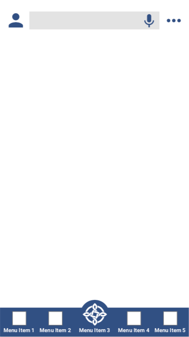
- Use a consistent layout across similar pages and components (WCAG 2.1, Material.io, iOS Human Interface Guidelines), including locations for menu item locations and button locations
- Provide navigation menus at the top and bottom of each page - see Menus
- Display the search bar at the top centre of each page - see Search, where a search facility is present
- Use a consistent layout for titles, headings, subtitles, body text - see Typography
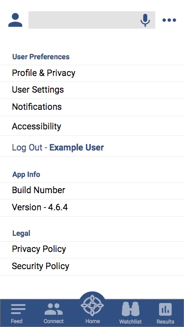
Consider and refer to layout standards, standard access points - see Menus and standard features - see Standard Features. Default positions for features include:
- Profile (top left)
- Settings (top right)
- Home (bottom centre)
Generic App Layout
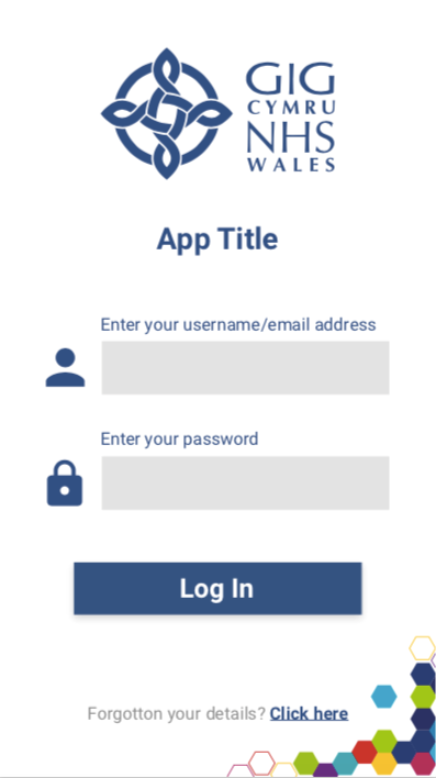
Log In Page
Columns for layout
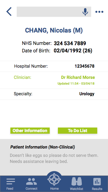
The app design must use a central column, for those pages that do not display data, such as results. Pages with a list of items must have a single column with left text alignment. The design should centre the most important data as a heading, where appropriate.
When the app design uses columns to display information:
- Do not use more than two columns, on a page with portrait orientation
- Information type, such as a field name, must appear in the left column
- Relevant information, such as the field contents, must appear in bold in the right column
- data fields must appear with only one data field on each row
Avoid a layout that requires a lot of scrolling.
Do not display too much information on one page (WCAG 2.1, ICO, GDPR). The layout must:
- Display the most important information without scrolling (WCAG 2.1)
- Avoid displaying more than ten data fields on a single page - see Data Entry
If the interface requires more than ten data fields, use multiple pages.
The app design should use margins and spacing where possible (iOS Human Interface Guidelines, Material.io, UWP).
Patient Information
Settings Menu