Most mobile apps provide common features such as the Home and Settings screens.
The app design must use standard features where relevant, including:
- Consistent terms (shared naming conventions) - see Terminology and Language
- Consistent icons (a shared icon set) - see Icons
- Consistent menu access points - see Menus
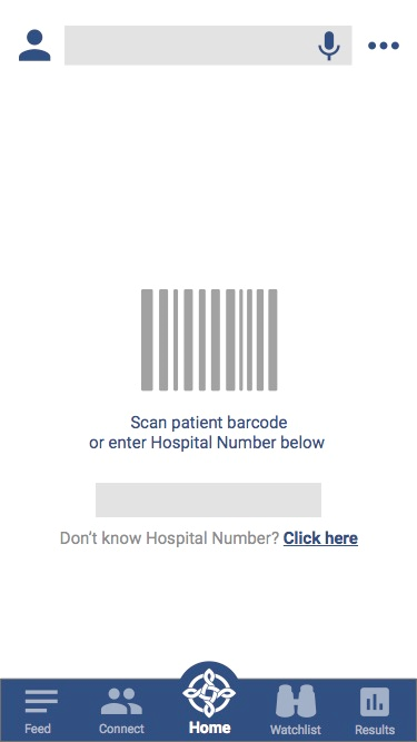
Home
The ‘Home Page’ or the ‘Main Screen/Page’ must include the most important app feature (primary reason for app) or provide a summary of the most important information. Users can configure or personalise this page through their settings if required.
Most Important Feature Appears on the Home Page
Settings
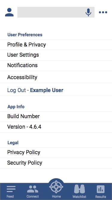
Settings access must appear as three dots in the top right corner. Settings must cover features such as:
- Technical settings
- Preferences
- Help
- App information
- Accessibility settings
- Feedback
- Legal/privacy information
- Log out
The app design must:
- Display settings as a list with left alignment (Material.io)
- Use visual dividers to separate list items
- Group settings into categories
- Show category titles
- Avoid using more than six main categories
- Avoid using more than six menu items within each category
Settings must save user preferences (Material.io).
Clicking a settings menu item must open a new page, which must have a back button (top left corner), to enable navigation back to the settings page.
Settings Page
Help
The settings menu must include Help, to access help functions such as support information and tutorials.
The app design should categorise support information by the app functions it relates to.
Help must provide answers to user questions (Material.io) that can include:
- Help topics
- Frequently asked questions (FAQ)
- Guides
- Tutorials
- Walkthroughs
Help content must use simple language, targeting a reading age of 7-9 (WCAG 2.1).
Avoid using technical language (Material.io).
Help content should contain step by step instructions and relevant images (Material.io).
Feed (if used)
A feed is a feature which provides regularly updated information such as:
- News
- Content
- Notices
- Social Media
A feed must display date and time that each item was received.
Feed Page
Enable scroll gestures, to allow the user to move through the feed items - see Touch Gesture Controls.
Information-only content does not require a notification, or action on the part of the user.
Critical feed items which require a response from the user, must:
- Provide a notification to alert the user, such as vibrating the phone or a sound
- Must enable the user to address and resolve the issue, using protocols that an appropriate governance group have established
In-app notifications - see Pop Ups - should prevent the user from doing other things until they take action (iOS Human Interface Guidelines).
Important or critical feed items must appear at the top of the feed until acknowledged by the user. After the user acknowledges a feed item, it must appear as a past feed item, with a different colour background, to differentiate it from unread feed items.
The feed display must show a one-month history of feed items, loading 10 items at a time.
Selecting a feed item must open a new page, which must include a back button (top left corner) to enable navigation back to the feed page.
The feed icon must signal important notices on the bottom menu, unless the app design includes a notification menu item. If a notification menu item is present, important notices must appear in notifications, and direct the user to relevant notice in feed for acknowledgement/read receipt.
Enable scroll gestures, to allow the user to move through the feed items. Swipe down gesture must allow the user to refresh the feed.
Selecting the feed menu item whilst in the feed must scroll to the top of the feed and refresh the page - see Menus.
See Touch Gesture Controls for guidance about standard control gestures.
Connection and Communication Functions
Connection and communication functions enable connecting or communicating with people or entities, such as a ward or patient within a particular hospital.
Features should include:
- A search bar at the top of the page to allow the user to search for connections
- Scroll gestures enabled to allow the user to move through connections and communications
- Swipe down gesture enabled to allow the user to refresh connections/communications
Selecting the connection/communication group menu item whilst in the feed must scroll to the top of the connection and communication page, and refresh the page - see Menus.
See Touch Gesture Controls for guidance about standard control gestures.
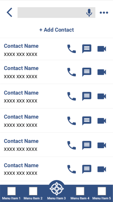
Connection/communication Page
Watchlist and Alerts
Clinician apps must provide watchlists and alerts. Notifications are generally used instead of watchlist/alerts for patient facing apps.
Watchlists and alerts must:
- Appear in order from highest to lowest priority by default. See Ordering.
- Enable scroll gestures to navigate through items.
- Enable swipe down gesture to refresh the page.
If the user selects a watchlist/alerts menu item whilst in the watchlist/alerts menu, the item must scroll to the top of the feed and refresh the page.
See Touch Gesture Controls for guidance about standard control gestures.
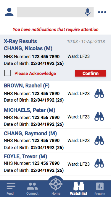
Watchlist
Users must be able to modify which patients or people appear on their watchlist.
Alerts
Users must address and resolve any alert using established and signed-off protocols, agreed at an appropriate governance level. For clinical alerts, both clinical and information governance personnel must sign off on protocols. The national body that signed off the protocols must appear at the top of this alert section, including signoff date, and be updated or ratified periodically.
| Alert Protocol Version | Sign Off Date | Signatories (list) |
|---|---|---|
| Pending |
Alerts must show the time and date they were triggered.
Critical alerts must:
- Provide a notification to the user, such as vibration or a sound
- Require an acknowledgement by the user
Critical notifications within the app should prevent the user from doing other things until they take action (iOS Human Interface Guidelines). See Pop Ups.
Important alerts must appear at the top of the page until the user acknowledges them. Once a user acknowledges an alert, the app must store it as a past alert and show it with a different colour background to differentiate it from current alerts.
The app must show a one-month history of alerts, loading 10 items at a time.
Feed/watchlist icons must signal alerts/important notices on the bottom menu.
Example Alert Notification
Alerts must appear in an accessible format, that differentiates high, medium and low priority alerts without relying on colour (see Accessibility) (WCAG 2.1). Alert levels include:
- High priority alerts: a hexagon with NWIS red fill
- Medium priority alerts: a triangle with a NWIS orange fill
- Low priority alerts (if required): a square with NWIS yellow fill
Optional discriminators relating to contrast between message/border and fill:
- High priority alerts may appear with highest density contrast message text/number and border
- Medium priority alerts may appear with a high density contrast message text/number and border
- If low priority alerts are required, they may appear with a standard density (W3C compliant) contrast message text/number border
These guidelines ensure that colour is not the sole visual representation of alerts (Material.io).
Notifications
Users must address and resolve any notification using established and signed-off protocols, agreed at an appropriate governance level. For clinical notifications both clinical and information governance personnel must sign off on protocols. The national body that signed off the protocols must appear at the top of this alert section, including signoff date, and be updated or ratified at least annually.
| Notification Protocol Version | Sign Off Date | Signatories (list) |
|---|---|---|
| Pending |
Watchlist Page in a Clinical App
The highest priority notifications must appear at the top of the page. After high priority notifications, the display shows the most recent notifications at the top of the page.
Notifications must include the time and date they were sent from the server, or received by the app if the server information is not available.
Critical alerts must provide a notification to the user.
Critical notifications within the app - see Pop Ups should prevent the user from doing other things until they take action (iOS Human Interface Guidelines).
Important notifications must appear at the top of the page until the user acknowledges them. Once a user acknowledges an alert, the app must store it as a past notification, and display it with a different colour background to differentiate it from new notifications.
The app must show a one-month history of notifications, loaded 10 items at a time.
Notifications must:
- Signal important notifications that may require receipt, via the notification menu item on bottom
- Enable scroll gestures to move through the feed items - see Touch Gesture Controls.
- Enable swipe down gesture to refresh the feed - see Touch Gesture Controls.
Clicking the notifications menu item whilst in the notifications menu must scroll to the top of the notifications menu and refresh the page - see Menus.
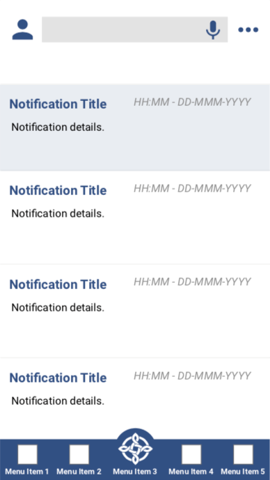
Notifications Page to View, Retrieve Notifications
Profile
This profile guidance applies to both clinical and patient apps.
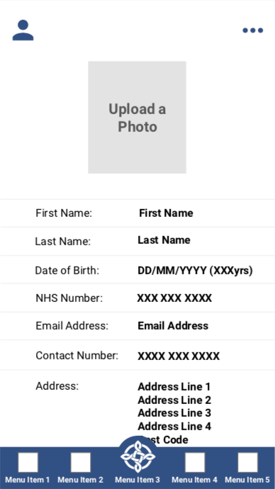
A profile must include at least three personal identifiers such as:
- First Name
- Last Name
- Date of Birth
- Address
- Contact Details
- NHS Number
Users must be able to view and edit their profile information.
Profile Page for Users to Edit
Search
See Search.
Orientation
App designs must support both portrait and landscape orientation (WCAG 2.1, iOS Human Interface Guidelines).
Use landscape orientation to optimise data display, like a table or chart.