Navigation
Fixed top and bottom (direct) menus must enable navigation to different sections of the app (Material.io, iOS Human Interface Guidelines).
Menu items must provide navigation only. Do not use menu items for actions (Material.io, iOS Human Interface Guidelines).
Selecting menu items must take the user to the main page associated with the menu item (Material.io).
On a direct menu item section, selecting the menu item must return the user to the top of the page and refresh the page data if applicable (Material.io). For example, on the ‘connect’ page (which is shown as a direct menu item in our sample application screenshots), selecting the connect menu will scroll the page to the top and refresh the data if applicable.
On a page which is not a direct menu item, selecting the menu item must return the user to the main page associated with the direct menu item. For example, on the ‘connect’ section but viewing patient details (not a direct menu item), selecting the connect menu item returns the user to the connect page.
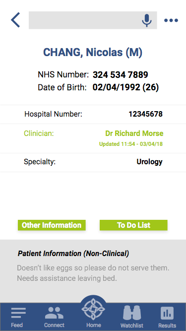
If there is no current direct menu location, a back button must enable navigation back to a menu location. The Back button must appear in the top left corner of the app, temporarily replacing the profile/menu item icon.
If the design includes a back button, it must also enable swipe navigation to return to the previous page, as an alternative. See Touch Gesture Control.
Layout
Bottom menu must have between three and five menu items (Material.io).
Bottom menu items should appear symmetrically across the screen.
Bottom menu items must take users to top level pages for the features, which users can access from anywhere in the app (Material.io, iOS Human Interface Guidelines).
Top menu must have no more than two items, on top left and top right of the screen.
All menu items must use:
- Consistent terms - see Terminology and Language
- Consistent icons - see Icons
- Colour to highlight the user’s current menu location, in a different colour to other menu items
- Colour of icons to show selected and deselected states: do not use two different icons to indicate selected and deselected states (iOS Human Interface Guidelines)
For menu items, the minimum touch target size is 44px x 44px, surrounded by a small amount of inactive space (WCAG 2.1, Material.io).
Wherever possible the app’s icon placement should remain symmetrical.
The app design must use standard menu access points to provide app functions:
- Bottom menu left – general information, content, feeds, library, guides etc.
- Bottom menu middle left – community and communication functions
- Bottom menu middle – home button using NHS Wales icon. Homepage must display most important app feature or summary of most important information
- Bottom menu middle right – notifications, alerts, watchlists
- Bottom menu right - outputs specific to the app such as results reports, galleries etc.
- Top left - profile
- Top right – settings and help
- Top middle - search
Layout with Back Button
Behaviour
Menu items must respond and adapt in size to different devices and screen sizes. See Responsiveness and Adaptivity.
The app design must enable menu items on all pages except when a keyboard is available (see below) (iOS Human Interface Guidelines). If a keyboard is available, the design must hide the bottom menu items (iOS Human Interface Guidelines).
Each menu item must:
- Provide an icon
- Include meaningful related text (Material.io) to explain the action
Menu item text must be short (Material.io). Do not wrap text around an icon, or shrink text to fit (Material.io).

Notifications
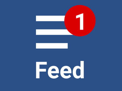
Menu items must display the relevant number of notifications in a red circle on the menu item, including:
- Critical notifications
- Pending requests
- Alerts requiring action