Font
Calibri should be used as the NWIS brand font for web content.
The app design must set font size in sp (Scale-independent Pixels). This measurement scales easily, to use larger font size for accessibility.
Example: (sp = px * ratio * scale)
General Font Standards
| Style | Font Type | Font Size (sp) | Font Case | Font Emphasis |
|---|---|---|---|---|
| Title | Calibri | 34 | Title | Bold |
| Heading | Calibri | 20 | Title | Bold |
| Subtitle | Calibri | 16 | Sentence | Plain |
| Body | Calibri | 14 | Sentence | Important information in bold i.e. patient name |
Font Size Conversions
| sp | pt | em/rem |
|---|---|---|
| 1.0 | 1.0 | 0.0625 |
Example Conversions
| sp | pt | em/rem |
|---|---|---|
| 10 | 10 | 0.625 |
| 12 | 12 | 0.75 |
| 24 | 24 | 1.5 |
| 60 | 60 | 3.75 |
Colour
The app design must use the NWIS primary palette for text colour. see Branding>Primary Palette.
Contrast
Text of 18pt or smaller must have a minimum contrast ratio of 4:5:1 between the colour of the text and the colour of the background behind the text - see Accessibility.
Text of more than 18pt must have a minimum contrast ratio of 3:1 between the text colour and the colour of the background behind the text.
Use the following tools to check contrast:
Style
The app design must use titles, headings, subtitles and body text consistently to create a hierarchy of information throughout the app (GOV.UK Design System).
The design must use bold to identify important information. Titles and headings must appear in bold text.
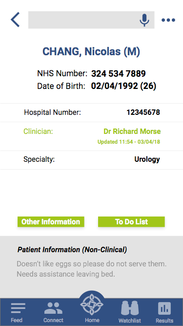
Clinical App: Patient Information is Centred, Bold
Paragraphs
Limit lines of text to 80 characters or less (WCAG 2.1). Text should not require horizontal scrolling to read (iOS Human Interface Guidelines).
Paragraphs (WCAG 2.1) must set:
- Line spacing 1.5 minimum, for body text
- Line height at least 1.5 times the font size
- Paragraph spacing at least 2 times larger than line spacing
- Letter spacing at least 0.12 times the font size
- Word spacing at least 0.16 times the font size
The layout must use lists to make blocks of text easier to read (GOV.UK Design System), and must separate list items with visual dividers.
Bullet points or numbering can make blocks of text easier to read if required (GOV.UK Design System).
Lists, bullet points, or numbering must use sentence case: capitalise the first letter of the first word for each item.
Numbered lists must show the number followed by a full stop (GOV.UK Design System, PulseTile UI Kit). Example:
- Lorem ipsum
- Lorem ipsum
Case
Avoid using all-capital letters, like SAVE, except for last names - see Terminology and Language.

Titles, headings, subtitles, buttons and icons must use title case, capitalising the first letter of each word. Examples:
- App name: for example, Welsh Clinical Portal
- Information type: for example, Date of Birth, Hospital Number, Patient Information
Body text, lists, bullet points and numbered lists must use sentence case, capitalising the first word only (Material.io).
Avoid adding shadows and borders for titles, headings, subtitles and body text.
Text Alignment
The layout must use left or centre alignment as default.
For the following use cases, text may use right alignment:
- Content related to a left alignment category
- Conversion to a right-alignment language like Arabic, Hebrew, or Urdu
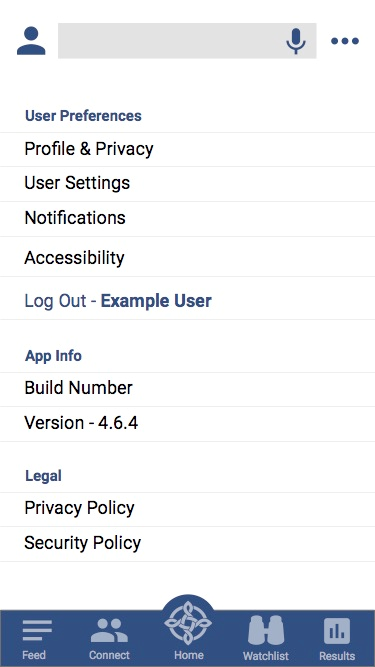
Settings page: General Settings, Preferences, Accessibility, Legal/Privacy, Log Out
Links
Users must be able to determine the purpose of the link from the link itself, or from link context (WCAG 2.1).
Links must appear consistently, including:
- Appropriate font
- Appropriate font size
- Appropriate font colour: links appear in NWIS Blue as default
- Underlining all links (GOV.UK Design System)
Linked text must not include a full stop at the end (GOV.UK Design System), even if the link is at the end of a sentence or paragraph.
Links must open within the app, either embedded on the access page or within a new page.
- If a link opens in web browser it must go to a UI responsive website
- If a link opens in web browser to a third party site, a warning message must notify the user - see Messaging
Link Text
| Style | Font Type | Font Size (em/rem) | Font Case | Font Emphasis |
|---|---|---|---|---|
| Body | Calibri | 14 | Sentence | Bold Underlined |
In-app Link

Standard Units
Use these units across all apps, to measure and define the elements listed. All other cases are treated as exceptions.
| Typographic element | Default measurement unit |
|---|---|
| Font size | sp |
| Touch targets | px |
| Icon resolution | px |
| Date | Numbers |
| Time | Numbers |
| PIN | Numbers |
| Measurements | See NHS Data Dictionary units of measurement |
| SI units | See National Physics Laboratory |